Dear Moderator, My name is Anaya Waine Candidate No '' ', and welcome to my A Level Media Studies blog. This is a record of the work I have undertaken for the Making Media (Component 03/04) non-examined assessment (NEA) within the OCR H409 GCE A Level course in Media Studies.
I worked independently on Brief 3: magazines online to produce the front cover and contents of the first two issues of an entertainment magazine.
Below you will find evidence of my research and planning for this task, including:
* my research into professionally produced music videos and artist websites that are similar in genre, style and form to those proposed in my chosen production brief. This includes:
* My deconstruction, analysis and notes on these professionally produced magazines and websites that has developed my knowledge and understanding of my chosen media form’s distinctive media language.
This includes for example:
• how genre conventions are employed
• how and why intertextuality is employed
• how combinations of media language elements such as framing, colour, typography, logos, page layout and mise en scène are used to create meaning and construct representations that address an intended audience.
I have also analysed professional magazine websites as part of my cross-media brief in terms of:
• layout
• navigation
• use of language
• use of images/text/audio/video.
PLANNING
In terms of planning, you will find below:
* Website research
* Website Planning
* Magazine Research
* Magazine Planning
* Audience Research
* Audience Feedback
STATEMENT OF INTENT
You will also find below the Statement of Intent I have completed for my cross-media production. My Statement of Intent outlines the ways in I proposed to link my media products to demonstrate my knowledge and understanding of the digitally convergent nature of my production. I also outline the ways in which I proposed to use the four areas of the media theoretical framework to communicate meaning and meet the requirements of the brief.
I hope you enjoy my work and find it both successful and interesting.
Friday, March 27, 2020
Tuesday, November 26, 2019


cover 1
cover 1 edits and final choice
- all edits made to fit colour descriptions used within magazine.
 -final choice


- all edits made to fit colour descriptions used within magazine.


Thursday, October 10, 2019
The main function of a front cover is to sell the magazine, they are meant to be bright and eye catching to gets its audience attention.

The main function of a front cover is to sell the magazine, they are meant to be bright and eye catching to gets its audience attention.
Slogan- is used under the header to explain the magazine content or make it stand out from its rivals.
Mast head- usually at the top of the page
fonts -Variety of font on the front cover make it interesting, some magazines however use the same throughout the cover.
Cover line/tag lines- are the main texts on the front cover the advertise the articles within the magazine.
The central image- usually a close up shot of model of body shot, usually shot in a studio to get the correct lighting and so the, model is ready and looks her, his best.
Task 2
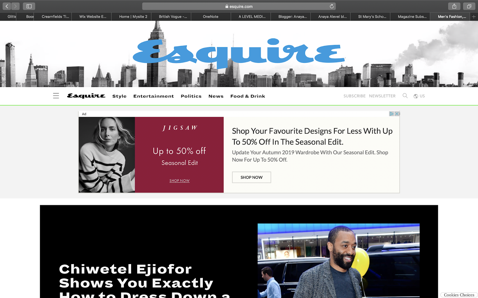

Esquire is a men's magazine which publishes articles on style, entertainment, politics, news and food & drink. Esquire is a clean cut magazine that targets its male audience very well through its aesthetic and the way in which it sells its magazine though its design and specific audience being men 30+. Esquire was first issued in October 1933 as an offshoot of trade magazine Apparel Arts


Cosmopolitan is an international fashion and entertainment magazine for women. The magazine was first published and distributed in 1886 in the US as a family magazine; it was later transformed into a literary magazine and since 1965 has become a women's magazine. The largest demographic for Cosmopolitan is women aged 18-34 with over 9 million readers in total.
Tuesday, October 1, 2019
TASK 4: MAGAZINE FRONT COVER ANALYSIS:

- medium shot of model, showing her face and upper body she is smiling but not with her teeth.
- models body is tilted with one shoulder back giving her a open body posture which is welcoming to the audience. Her chin being lifted gives the model an elegant and proud look showing her beuty through her posture and the way she is stood.
- serif, elegant font, clean on the page and not overly cluttered, with the colour going well with the photo of the model.
-use of gold colour for the font against her tanned skin and golden hair with the golden/brass clothing, standing out against the light grey background and balck and white text. All the colours used work well together and stand out from each other but not in a harsh way to the eye.

-Long shot showing models full body (head to foot/lower ankle)
-model is smiling with a teeth on show, looks like she may have been laughing when the photo was taken
-the magazine cover itself has a lot of content on it in comparison to the vogue one I looked at before. With a mixture of colours yellow white and black apposing the main theme of pink and red though out the cover. However they have chosen to dress the model in pink/red clothing which goes together nicely with the cosmopolitan banner running behind her head.
-the text is serif, in a chunky font different to the vouge one which was elegant, the chunky text does stand out from the page against the models photo. By being so cluttered on the page it does make the magazine look like it has plenty of content, it also gives an idea of the content by having the titles.
-the use of the pink tones through out the cover all work well together from her eye makeup and lip colour to her shoes and the colour of the text in the back and the background. The candy floff pink re enforces that it is a magazine targeted at girls, given that girls traditionaly like pink, red and boys like blue, black.
Subscribe to:
Posts (Atom)
-
task 1: industry - research of sony music site used: https://www.sme.co.jp/s/SMEen/page/company_history?ima=0000&link=ROBO004 (sony m...

